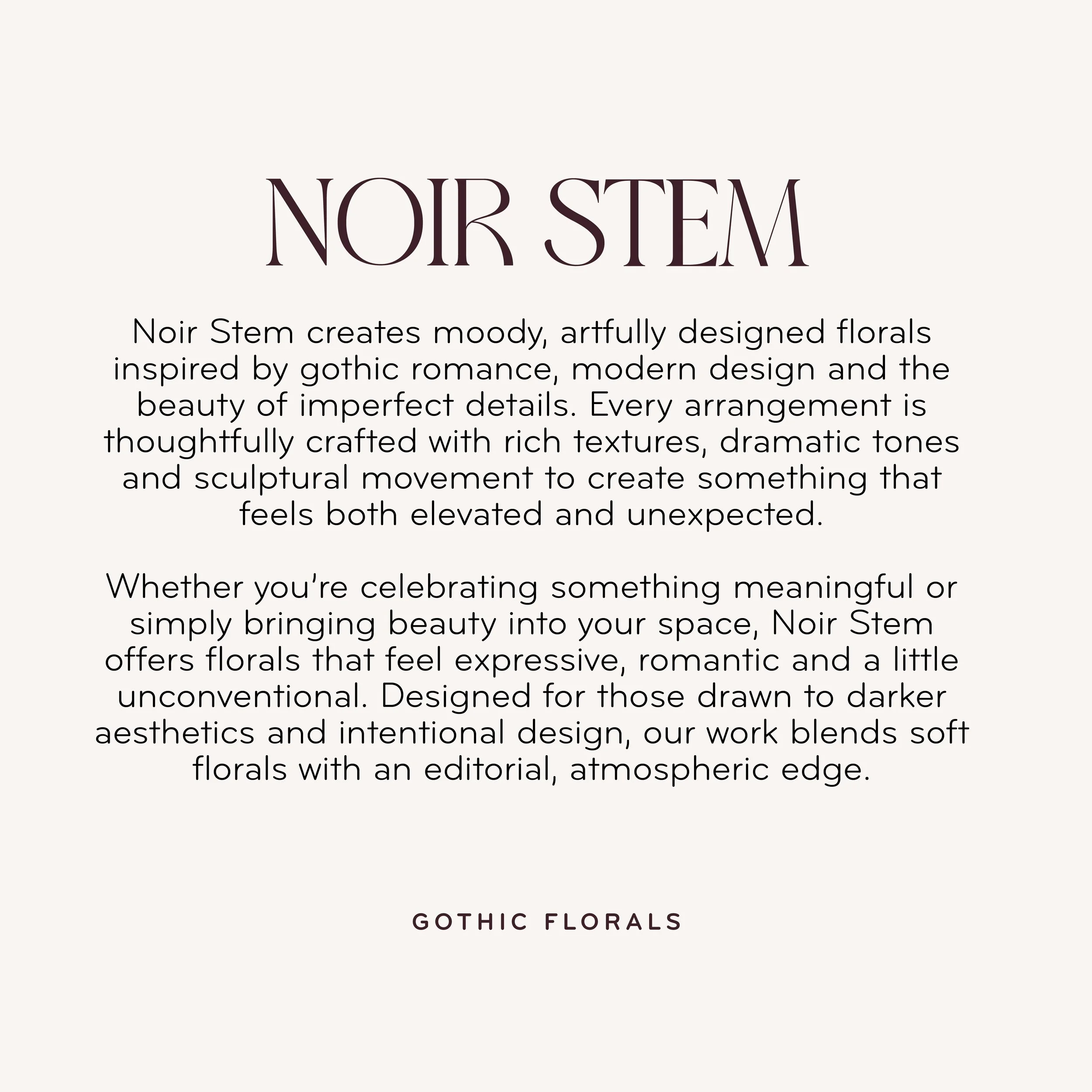
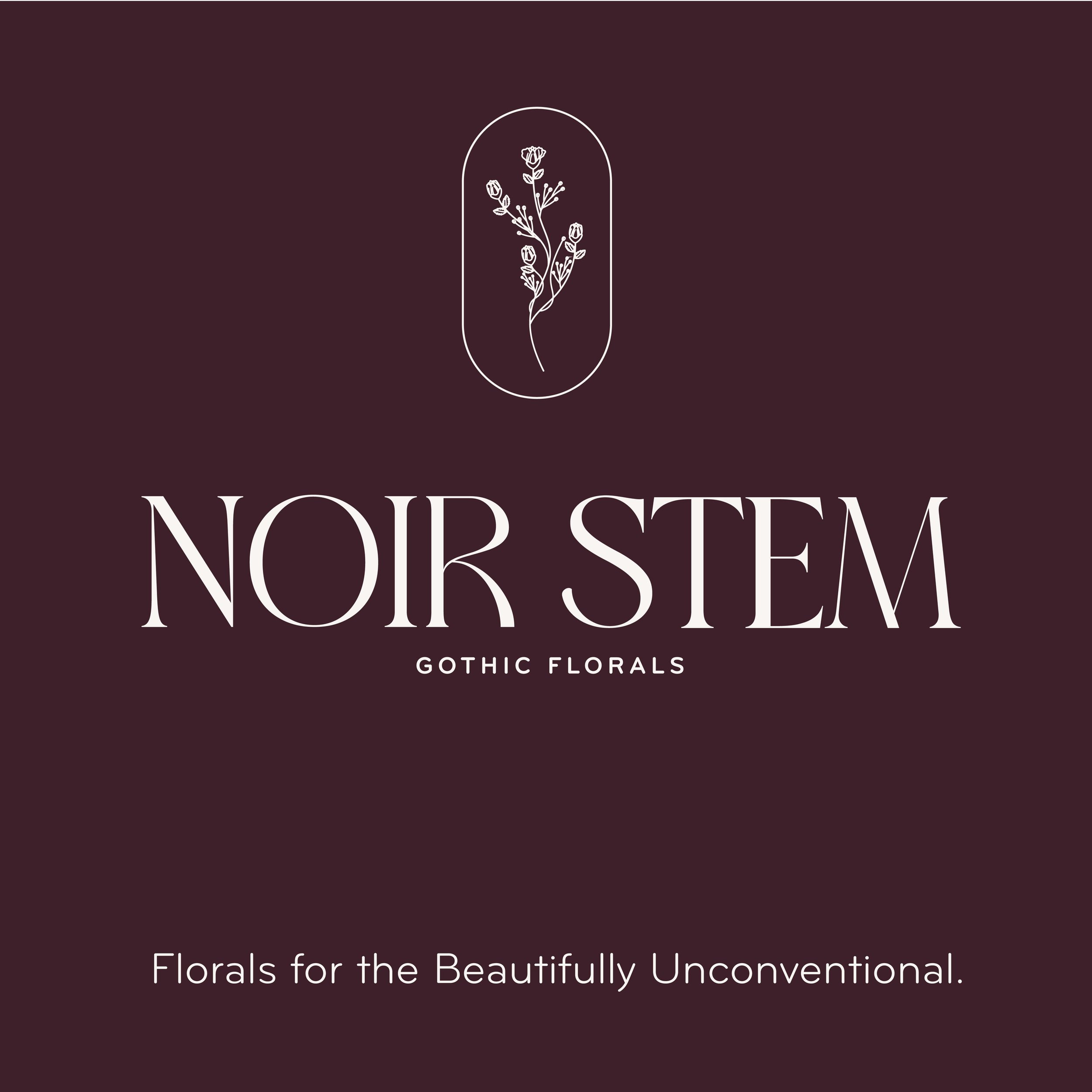
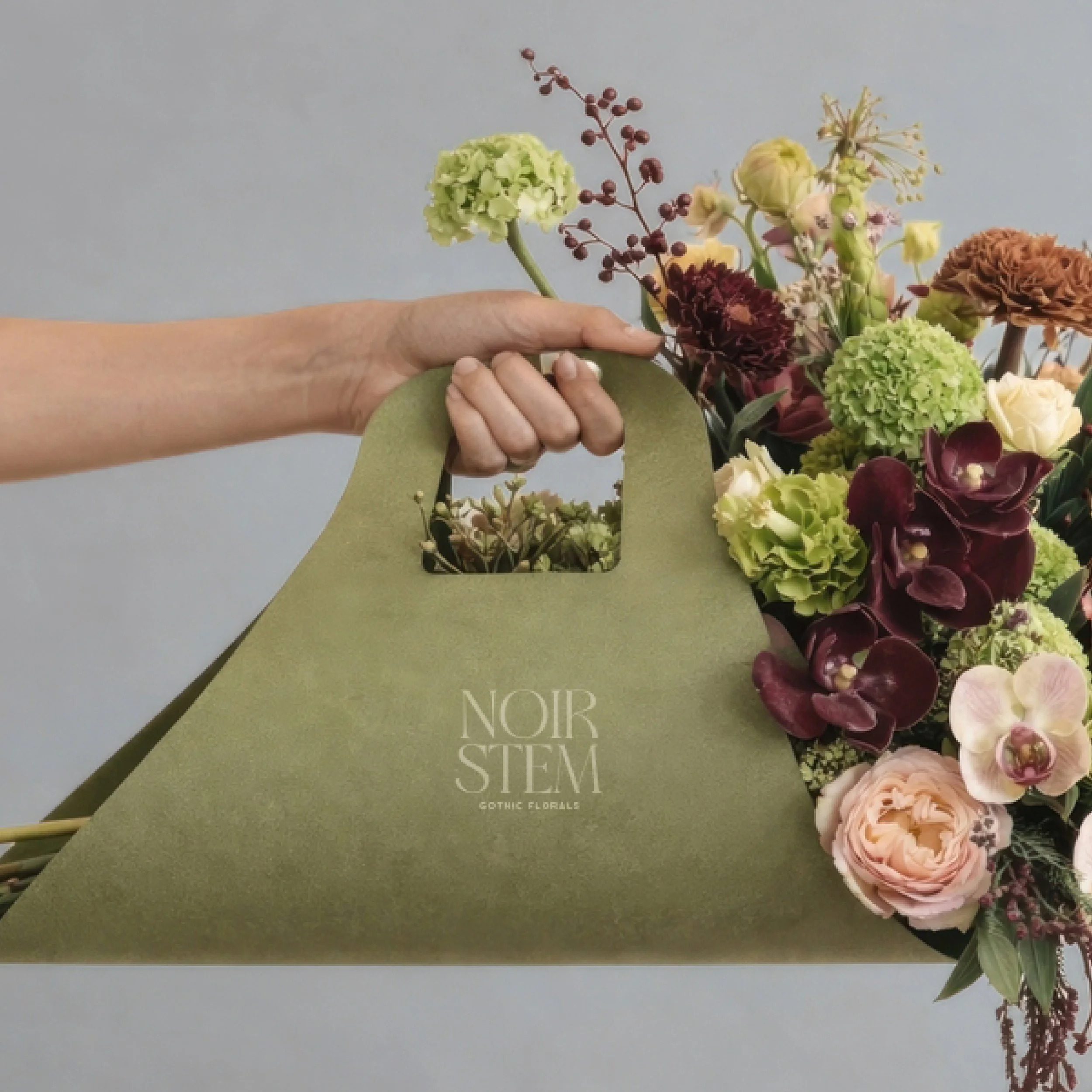
Brand Identity
The Reform brand system is built around contrast — soft curves paired with structure. The custom serif logo introduces a sense of elegance and refinement, while the minimalist supporting typography keeps the system modern and clean. Together, they create a visual language that feels timeless, architectural and elevated. The monogram symbol acts as a recognizable stamp for the brand and reinforces the idea of movement and transformation through its fluid, sculptural form.